Friday, 21 December 2012

week 11 muscles


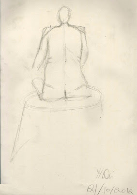
in this drawing does show off the pose well and does have bit of detail such as the muscles in the neck, the chest such as hair and there seems to be some slight shading around the body. however there isnt enough shading around the body and makes the image very hollow. the arms seem far to skinny and don't show off any muscle at all and are far too straight. there seem to be a bit to much negative space between the legs. there is room for improvement such as adding more detail and shading this make the image look much more realistic and also adding in detail on the head, arms and feet.  


anatomical study 

the images below are anatomical study of certain  parts of the body rather than the whole body. here we get more detail in the study and be able to see curves, lighting and bone structure of the model. 


torso

here is a study of torso. the proportion on the body is right size, we get a good outline of the body and even the curve on the spine however the arms are to straight we don't really see the muscle and how the muscles curve. there is some good shading around the body and some nice detail in the skin such as on the spine, with the detail on spine and helps to show the curvature of the spine. 


leg

here we have a study of a leg, we can see that this study has a lot more detail added compared to the previous study, such as curves of the calf muscles and detail such as shading and hair.  the shading here is used to indicate the bones such as the ankle. there is some nice detail added such as the hair on the leg as well as little shading on the leg. however  there could been bit more shading on the calf area.


Thursday, 20 December 2012

week 10- movement


this post is all about movement. here we will see quick sketches of model as well as the movement of the model. the skill of being able to quickly sketch movement are great help to improve on anatomical skills and of animation and video games these are mainly used in pre production such as story boards.


quick sketches 

here we have 3 quick sketches of model in different poses using drawing techniques know as continuous line . this is where you continue drawing without removing the pencil form the page. you can see that the images do improve. all the images do help to show off the pose of the model, the left image does show some weight and balance. we can see that most of the weight is on the left arm and the body leans towards left to balance out the weight. the right image also shows so weight and balance as the pose shows how the legs are evenly. however the biggest problem with the images are the proportion of the bodies are wrong, the some torso are to wide and the legs to skinny such as the middle image.  


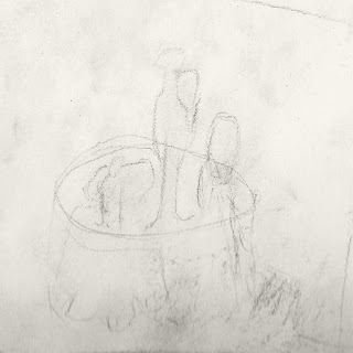
here we see a quick sketch of moving person. this is very rushed and early drawing that was done, however even though this rushed we get enough information about how the persons walks around the table. however the sketches aren't very well done as it doesn't show the proportion  well and by the end the bodies get much more skinny and doesn't really show how the placement of body such as legs, arms. there is a lot of work to be done to improve. 


direct study

here we have a quick study of some movement, there are a verity of different movements sketch here, walking, stand and punching these are just practice to on the movement drawing techniques.  you can a slight improvements.   


Tuesday, 18 December 2012

week 9 Basic Anatomy (no week 8 cause was at BAF Game)


this week was all about anatomy so that means we were doing drawings of life model. this was my first time doing such type of drawing and looking at my work I have a long way to go. 

stage 1- quick sketches (1 min each)

Here we have some quick sketches of the model. we can see that there is some  planing such as place lines on page which outline where the shoulder and the angle of the shoulder as well. also mapping out where arms go as well as the spine. this is to help when drawing the model as know where to draw. 


stage 2
this drawing took 5 minutes here you can see more planning such as where the body parts such as legs, arms etc will be placed as well as the angle of the hips and waist. one problem you can see is from the leg on the right side of the page there is far to much negative space between the legs, the torso doesn't look very realistic as the right side of the torso is to straight there isn't any curves at all.  


stage 3

in this image so can see the use of measurements by using the pencil to mark out the length of the model and  to mark out the waist and length of the arms. here the drawing is much better the curves are much better and the proportion of the model has improved. however the head does seem a bit to small and the arms aren't very well detail and doesn't show any muscle and look to straight. 


                                                                              stage 4


here is the final image of the model, we can clearly see how this image has used the techniques from previous   sketches. the proportions on the body are right and the head looks right size. there is some detail around the body such as curves and folds in body. however there isn't much shading on the body and left leg looks out of place. 


direct study 

direct study  image 1- front view 
we get good sense of the pose in this image, we can see that the model is angled away from us. there is a bit of foreshorten on the left shoulder as it is angled away from the viewer. the breasts aren't well drawn as there  far to many hairy lines around them that they don't look natural. the hand isn't well drawn and doesn't look natural. the neck if far to big. 


direct study  image 2- back view 

their some good use of detail in this image such as the shading on the hair, as certain areas are more darker than others due to the light, the folds on the skin are clear as well and we can even seen the line of the spine. their is some good shading being used here as you can see around the shoulder areas their is a much darker value due to the model being angled away from the light. 


direct study  image 3- side view 

good sense of pose in this image, we can see a little foreshortening on the back of the leg and on the shoulders as we have just see where the other leg and arm is. the breasts are a bit smaller compared to the model and as you can see their have been attempts to correct this in the drawing. their isn't as much shading on this model compared to previous drawings, the shading is mostly event on the right side of the body and the hair.  to improve this drawing its should include more shading around rest of the body to make the image. the arm is far to straight and doesn't show much muscle. 


Wednesday, 21 November 2012

week 7 Texture


below are studies of a sliver vase and drapery. these studies are of the textures of the vase and drapery.
from this first study we can see that 2 versions of each object, and each version has different techniques in how they are drawn.

this is the first attempt of the drapery. as you can see the image on the left doesn't have as much information as the right image. the left image does a some of the pattern of the drapery but not shading at all. the right  image has much more detail you can see the patterns and how they overlap, looking at this image it looks as if the drapery is folded. some shading is evident around the image.  


here we is a study of vases. both images have different techniques for its shading. the left image has some good shading the darker values represent the reflection in the vase and lighter values represent the sliver texture on the vase. the right image  uses horizontal shading as to the vertical shading on the left image. 


this drapery is more detailed as it has the drapery pattern, with the pattern on this drawing you can see how the drapery is folded up. the drawing does have some shading but it is incomplete and doesn't have much shading. 


this is the final drawing of the composition. as you can see from this composition it has the vase and the drapery which was used for the studies. we can see from this drawing that the vase has the same shading technique as the study above. you can also see in this picture that the artist has tried to save the drawing as you can see the original sketch of the vases, as you can see the original sketch of the vase was to far to the left of the table and seem small compared to the table. whereas the finished vases are much more centred. the shading helps to define what areas of the vases, the darker values represent the reflections e.g of people and the lighter value is to represent the shine of the surface.   


week 6 still life: Natural & Man Made forms


in still life is the arrangement of inanimate objects this can be both natural objects such as  fruit or man made objects like tea pot or plate. with still life composition you have a verity of different textures and surfaces.  


the below drawing show multiple sketches of different angles of the composition  this is to help me think which composition is best one to draw   


sketch 1

in this sketch we can see we have few objects in this composition but is quite boring as there isnt much in this image 


sketch 2

in this sketch we have much natural objects as well as mad made objects. we can also see that there is some good lighting and shadows on the objects. 


this is the final drawing of the composition. here you can see the different objects such as natural and mad made forms. as you can see on the man made objects there is some shading on the objects as well as shadows such as the vases in the right side of the page. on the cabbage you can see the texture of leaves but without proper shading the cabbage looks hollow and 2D. As you can see from this image some of the objects in this composition are kissing such as the 2 vases and the pumpkin and the back vase. also the vegetable on the left had side of the page appears to be orphaned but if you look closely it is connected to rest of the composition as there is a leek in the background.   


the image as a whole does seem to be slanting to side, which is very unprofessional in the future I will make sure to make the image centred. the drapery is satisfactory, there is some nice shading at the bottom of the table.


improvements which need to be made are:
time- I need to improve on my time management when it comes to drawing, I have made improvement other the weeks but I need to keep practising
shading- add more shading to make the image feel much more 3D rather than just flat


directed study 

directed study  image 1 


here is a quick sketch of table top filled with natural and man made objects. as you can the 2 fruits have different textures, one uses dotted shading and other uses vertical shading to create the separate textures, this helps to show these are 2 different types of fruit. the fruit on the far end of the table is orphaned from the rest of the objects, if it was brought in a few cm it would feel apart of the composition. 


 directed study image 2

this still life composition only consists of man made objects their is no natural objects in this scene. first off the 2 objects are kissing as you can see the mask is leaning on the hat. another problem with this composition  is their is an even number of objects, the problem with this is we automatically pair up objects if their is an even number of them. the pairing of these objects is emphasised more as they are kissing so we see the composition as a pair. their  is some good shading used here such as on the hat. the bottom part of the hat does have some lighter values and as you move up the values become much darker showing their isn't much light reaching top of the hat.    


week 5 landscape drawing


this week we used pastels to draw some trees around university as the leaves were changing colours so it was best time to try out some pastel drawing.


this image below is image of the pastel drawing I have done. 
as you can see at the right bottom of the page you can see all the pastel marks, these are my study as I was trying out various different combination of colours in order to find right combination to use for example dark green and brown together work well to create the bark of the tree.  

with the image its self all I did was make a very quick outline of the tree and its branches. once that was done I work on creating the impression of the leaves, I smug colours together but then used the pastel much harder on the page to make the colour stand out more. 

what's most compelling about this image is the colours used in this landscape the blend of colours used to create the impression of leaves make the image stand out and even makes the leaves the focal point of the image. also the background creates a very cool feeling to the image as the blue contrast with the fiery colours of the leaves.   


week 4 light and shadow


this entry is all about light and shadows 

lights and shadows are a vital part of  drawing as they define the object and gives the object a sense of 3D 

 here we have a 3 studies of lighting. each of these objects has a different technique of shading.


first study 

in this first study we can see the different values on the page, from these values we can see the intensity of the  shadows. for example we can see that the shadow at the top has a dark values and gradually becomes lighter. with this cast shadow we can indicate the location of the light source from this study.     


second study

here we can see that the same shading techniques as the last study such as the diagonal shading. however the light and dark values are much better compared to first study such as the front face we can see there are different values.     


third study 


in this study we can see that there is a lot of darker values on front face, and as you can see the values becoming lighter, this helps to give the study a more 3D effect. here we can see different drawing style for the shading there is more vertical and horizontal lines.     


this image below is of a ball with drape on it. here you can see the quick fluid motion to get the shape of the ball and also the drape. we can clearly see the shape of the ball under the drapery and also the shape of the drapery hanging off the ball. there is also some shading evident in this image such as around the drapery and at the bottom of the drapery. there are a few problems such as the chair, you can see it was rushed, the chair is not centred with the ball so its very unbalanced and it looks like the ball could fall off the chair.


directed study 

directed study image 1
here we have a study of a bottle, we can see that the right side of the bottle has darker values, this is to help to create a 3D effect but the shading should be more darker to create a more convincing 3D effect. the centre of the bottle has the most light values, the dark spots on the bottle are meant to represent the shining parts of the bottle however the shading should of been lighter rather than darker because it can confusing. we can also see the cast shadow, as you can see the centre of the shadow contains the darkest values and around the shadow you have lighter shadow around it.  


directed study image 2

here we have a study of a cup. the shading is on the cast shadow is significantly better than previous study as the shadow is cast on surface. the shadow has verity of values as you can see the shadow starts off with dark value and gradually become lighter.   


week 3 Composition


composition is the arrangement of objects etc in art, there are a few elements in composition such as: 

depth: giving the illusion of depth in the picture which creates a 3D dimension.

line: this can be either implied or an actual line. this is when  your eyes follow a line either a line you can see or an implied line where you subconsciously follow it like a line.  


in this image below is of quick sketches of some compositions of trees and bushes around the university from these sketches help me pick which composition I think would be best to draw due to its Composition, lighting etc and make a full image. 


 this first sketch 

this first sketch is off a line of trees going into the distance. as you can see the tress are at the top of a hill and the rest of the image is of the hill. here you can really make out the foreshortening  as the trees get smaller further down the image. also makes good use of the implied line as the trees follow the edge of the hill. I chose this as image to be my final piece as it allows to show off a verity of techniques. 


second sketch 

this sketch is of some bushes. here we can see the impressionistic techniques on the leaves. you can also see an implied line as you can follow the tops of the bushes. the image is quite balanced, the bush are also in the rule of thirds as they are centre of the image and are the focal point of the image.


third sketch 

this sketch is a portrait of single tree, here we can see impressionist techniques on the leaves and some of the plants and grass on the ground. we can also see trees in the back ground. this is a good image and could be used to create a great amount of detail in lighting and texture if it was chosen for the final image.  


here is the full image which was based of the first sketch. as you can see from the trees they have a sense of depth as the trees go further away and look smaller this also know as foreshortening. there is also an implied line in the image as you eyes follow the trees. also there is use of impressionistic drawing for the leaves. the biggest problem is that  the picture wasn't finished on time .also the image seems only to be on one side of the page, this is due to the fact the line of trees are on the edge of a hill perhaps if there was more detail in the hill such as the grass or showing how the hill is curves downwards . 


direct study 

this landscape was created using pastels, you can that there is a lot impressionistic drawing used here such as grass and the leaves on the patches of dirt, you can see that they are quick motions with the pastel to create a impression of the leaves. same with the ground the grass has some strong pastel marks on the paper to show create impression of grass. the colours on the wall help to create show the age of the wall be showing how the bricks have become discoloured over the years e.g mould. however there is far to much white in this image which takes way from the image. second the trees in the background feel very flat.  


here is a landscape of a side of wall. as you can see their appears to be a foreshortening effect at end of the image but it doesn't work well as it seems the wall is just slanting into the image. their is some implied line in this image as you can follow the tops of the trees which can guide the viewers through the image. their is some impressionistic drawing on the leaves on tress and wall.    


week 2 landscape


this week was where we learnt about landscape. 

landscape is not just outside but can be of man made structures such as street or interiors and even the sea. when doing landscape there are a few techniques when drawing landscape here are a few.  

horizon line- is a implied line which represents the hight of the viewers eye, it also helps to show when objects are much further away in the scene    

vanishing point- is where all the parallel lines converge. there can be up to 3  

Orthogonal Lines- is a line which is drawn from a corner of a object which goes to the vanishing point. this helps to create illusion of  perpendicular lines which goes into the distance.  

Foreshortening- is an optical illusion that makes objects and/or distance seem shorter than it is, this is due to how the object is angled away from the viewer


in this image below is of a one point perspective drawing of environment in the university. within this image you can make out the planing on the drawing, you can see in the middle of the page the horizon line. this used  to map where the buildings and the distance of the buildings. after that used my pencil to measure the length and hight of the buildings. vanishing points to help plan/map out the buildings. however there a few problems with the drawing, as you can in the top left of the image, there a numerous lines which are trying to create the building in front. there isn't much detail in the drawing such as on the wall near the van and on the van itself. but there is some slight detail in the middle of the drawing, the wall and windows.     


direct study 


this is a one point perspective of a street. first thing to point out on this image is you can make out the planning  such as the vanish points and the Orthogonal Lines. this image has good use of foreshortening, the building on the right and the one in the back, do show off good use of foreshortening, this really helps to create much more depth in the picture. detail is added in this image as well, the roofs of the buildings look as if they have tiles. the tiles aren't in prefect lines or consistent, this isn't a negative quality as these old Victoria roofs aren't straight or have perfect tiles. the tiles in the image help show that these house are much older due. the houses have some bricks draw on, this is to create a impression of the bricks rather than having the the entire house covered in bricks. there are a few things which could been improved on the windows and doors seem rushed and don't have that much detail and also the garden no the left seems very barren it. it could been improved if there were objects in the garden. 


week 1 techniques/ basic marks

so for first week we learnt basic of drawing. for one how to hold a pencil, there are 2 ways you can do so, both techniques require you to hold the pencil near the bottom and you don't draw from your wrist but with whole of your arm. by doing this you get much fluid marks on the page making it easier to draw objects, people etc etc. you can hold the pencil using the thumb or the index finger, I had to find best way for me to draw and usually use my index finger.
then try some shading techniques such as shading, horizontal, vertical, diagonal and also shading using circular motion.   

about me and hard journey to a land which will be hard to endure

right so this is my blog of all the "drawings" that I will have done for observational drawing for uni. hopefully you will follow me on this journey as I (and I hope) become a some what alright artist. but seriously I will be making this blog to show my progress (most likely this will be the last informal blog I will do) of the work i will do for uni. I hope you will that I will be improving through out this blog. so with that said lets begin